914-SOLID is a sleek, geometric sans serif font with a futuristic and tech-inspired feel. It features bold, solid uppercase letters with a pronounced, squared-off design, high contrast between thick and thin strokes, and a condensed width that adds a modern, streamlined look. Ideal for branding, logos, and headlines, it communicates innovation and strength with its clean, sharp lines and distinctive character shapes.
914-SOLID Font
Downloads
0 downloads
Published
2026-04-06
License
See license description
Download 914-SOLID Font →
Includes ZIP + license: See license description
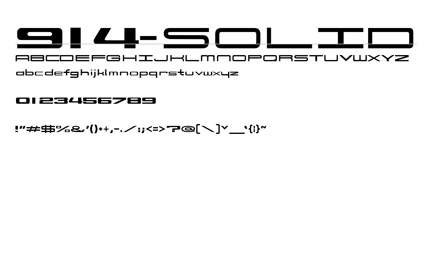
About 914-SOLID Font
Font information
| Font family | 914-SOLID Font |
|---|---|
| License | See license description |
| Category | Sans-serif |
| Languages supported | Latin, Symbols |
| Release date | 2009-04-18 |
| Designer | E. V. Norat II |
| Trademark | 914-SOLID is a trademark of E. V. Norat II. |
| Font subfamily | Italic, Expanded |
| Tags | italic expanded latin symbols display |
| File size | 56.31 KB |
| File type | TTF |
| Version | 1.0 |
Licesing information
FONT NAME: 914-SOLID Copyright (c) 2009 by E. V. Norat II. All rights reserved. Permission to use this font is only granted for non-commerical; non-profit; private and/or personal purposes. Commercial use of this font is prohibited. This font is a rounded corner box shape, Sans Serif, Gothic, extended / expanded and Euro style type of font. It is similiar, but not an exact duplicate, of the characters that were once used, in reference to the now discontinued 914 automovtive/sports vehicle that was manufactured between 1969-1975. This font was used on various emblems, signage, placquards, brouchures, literature, promotional items, racing applications and/or other applications. Unfortunately, the original font was only made in a dozen or so upper case letters and numbers. Therefore, all of these characters are an interpretation/interpolation, such as a "best guess" or "what it should be" scenario. This font conversion/interpretation has been "cleaned up" and now has a font ratio of 1:5:11 ( Line width : height : width ).